Non-metric Multidimensional Scaling (NMDS) in R
By Michael Meyer
Summary
This document details the general workflow for performing Non-metric Multidimensional Scaling (NMDS), using macroinvertebrate composition data from the National Ecological Observatory Network (NEON).
NMDS is a tool to assess similarity between samples when considering multiple variables of interest. It is analogous to Principal Component Analysis (PCA) with respect to identifying groups based on a suite of variables. Unlike PCA though, NMDS is not constrained by assumptions of multivariate normality and multivariate homoscedasticity.
In general, this document is geared towards ecologically-focused researchers, although NMDS can be useful in multiple different fields.
This work was presented to the R Working Group in Fall 2019.
Creating a distance/similarity metric
Before diving into the details of creating an NMDS, I will discuss the idea of "distance" or "similarity" in a statistical sense. For the purposes of this tutorial I will use the terms interchangeably. While distance is not a term usually covered in statistics classes (especially at the introductory level), it is important to remember that all statistical test are trying to uncover a distance between populations. Of course, the distance may vary with respect to units, meaning, or the way its calculated, but the overarching goal is to measure how far apart populations are.
We can demonstrate this point looking at how sepal length varies among different iris species.
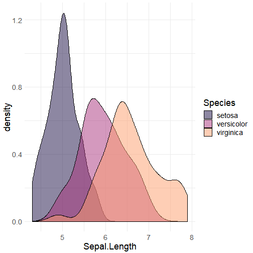
From the above density plot, we can see that each species appears to have a characteristic mean sepal length. In other words, it appears that we may be able to distinguish species by how the distance between mean sepal lengths compares. In doing so, we can determine which species are more or less similar to one another, where a lesser distance value implies two populations as being more similar. In the case of sepal length, we see that virginica and versicolor have means that are closer to one another than virginica and setosa.
Similarly, we may want to compare how these same species differ based off sepal length as well as petal length.
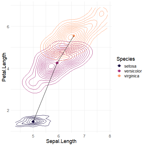
Here, we have a 2-dimensional density plot of sepal length and petal length, and it becomes even more evident how distinct the three species are based off each species's characteristic morphologies. The point within each species density cloud is located at the mean sepal length and petal length for each species. The black line between points is meant to show the "distance" between each mean.
If we wanted to calculate these distances, we could turn to the Pythagorean Theorem.
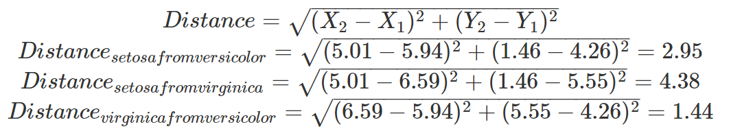
In doing so, we could effectively collapse our two-dimensional data (i.e., Sepal Length and Petal Length) into a one-dimensional unit (i.e., Distance). We see that virginica and versicolor have the smallest distance metric, implying that these two species are more morphometrically similar, whereas setosa and virginica have the largest distance metric, suggesting that these two species are most morphometrically different. Finally, we also notice that the points are arranged in a two-dimensional space, concordant with this distance, which allows us to visually interpret points that are closer together as more similar and points that are farther apart as less similar.
While we have illustrated this point in two dimensions, it is conceivable that we could also consider any number of variables, using the same formula to produce a distance metric. Herein lies the power of the distance metric.
Types of distance metrics
In the above example, we calculated Euclidean Distance, which is based on the magnitude of dissimilarity between samples. However, there are cases, particularly in ecological contexts, where a Euclidean Distance is not preferred.
Let's consider an example of species counts for three sites.
| site | species_1 | species_2 | species_3 |
|---|---|---|---|
| A | 0 | 1 | 1 |
| B | 1 | 0 | 0 |
| C | 0 | 4 | 4 |
If we were to produce the Euclidean distances between each of the sites, it would look something like this:
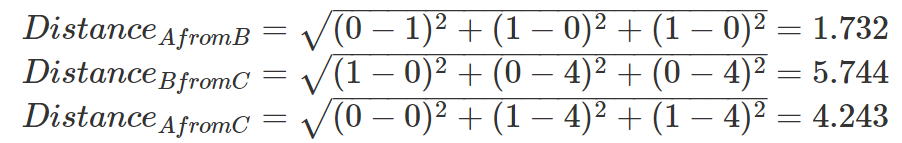
So, based on these calculated distance metrics, sites A and B are most similar. This conclusion, however, may be counter-intuitive to most ecologists. An ecologist would likely consider sites A and C to be more similar as they contain the same species compositions but differ in the magnitude of individuals. So, an ecologist may require a slightly different metric, such that sites A and C are represented as being more similar.
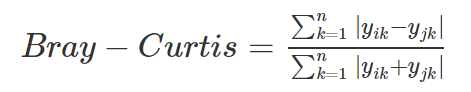
For this reason, most ecologists use the Bray-Curtis similarity metric, which is defined as:
Using a Bray-Curtis similarity metric, we can recalculate similarity between the sites.
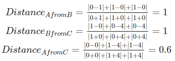
Our analysis now shows that sites A and C are most similar, whereas A and C are most dissimilar from B. In general, this is congruent with how an ecologist would view these systems.
Plotting an NMDS
Once distance or similarity metrics have been calculated, the next step of creating an NMDS is to arrange the points in as few of dimensions as possible, where points are spaced from each other approximately as far as their distance or similarity metric. In doing so, points that are located closer together represent samples that are more similar, and points farther away represent less similar samples.
In most cases, researchers try to place points within two dimensions. However, it is possible to place points in 3, 4, 5....n dimensions. Regardless of the number of dimensions, the characteristic value representing how well points fit within the specified number of dimensions is defined by "Stress". While this tutorial will not go into the details of how stress is calculated, there are loose and often field-specific guidelines for evaluating if stress is acceptable for interpretation.
In the case of ecological and environmental data, here are some general guidelines:
- Stress > 0.2: Likely not reliable for interpretation
- Stress 0.15: Likely fine for interpretation
- Stress 0.1: Likely good for interpretation
- Stress < 0.1: Likely great for interpretation
Creating an NMDS in R
Now that we've discussed the idea behind creating an NMDS, let's actually make one!
The setup
When I originally created this tutorial, I wanted a reminder of which macroinvertebrates were more associated with river systems and which were associated with lacustrine systems. Despite being a PhD Candidate in aquatic ecology, this is one thing that I can never seem to remember. So, I found some continental-scale data spanning across approximately five years to see if I could make a reminder!
Data
The data used in this tutorial come from the National Ecological Observatory Network (NEON). The data are benthic macroinvertebrate species counts for rivers and lakes throughout the entire United States and were collected between July 2014 to the present.
While future users are welcome to download the original raw data from NEON, the data used in this tutorial have been paired down to macroinvertebrate order counts for all sampling locations and time-points.
The data from this tutorial can be downloaded here.
To get a better sense of the data, let's read it into R.
 1orders <- read.csv("condensed_order.csv", header = TRUE)
 2head(orders)
 3
 4##   siteID  namedLocation         collectDate Amphipoda Coleoptera Diptera
 5## 1   ARIK ARIK.AOS.reach 2014-07-14 17:51:00         0         42     210
 6## 2   ARIK ARIK.AOS.reach 2014-09-29 18:20:00         0          5      54
 7## 3   ARIK ARIK.AOS.reach 2015-03-25 17:15:00         0          7     336
 8## 4   ARIK ARIK.AOS.reach 2015-07-14 14:55:00         0         14      80
 9## 5   ARIK ARIK.AOS.reach 2016-03-31 15:41:00         0          2     210
10## 6   ARIK ARIK.AOS.reach 2016-07-13 15:24:00         0         43     647
11##   Ephemeroptera Hemiptera Trichoptera Trombidiformes Tubificida
12## 1            27        27           0              6         20
13## 2             9         2           0              1          0
14## 3             2         1          11             59         13
15## 4             1         1           0              1          1
16## 5             0         0           4              4         34
17## 6            38         3           1             16         77
18##   decimalLatitude decimalLongitude aquaticSiteType elevation
19## 1        39.75821        -102.4471          stream    1179.5
20## 2        39.75821        -102.4471          stream    1179.5
21## 3        39.75821        -102.4471          stream    1179.5
22## 4        39.75821        -102.4471          stream    1179.5
23## 5        39.75821        -102.4471          stream    1179.5
24## 6        39.75821        -102.4471          stream    1179.5
We see that the dataset contains eight different orders, locational coordinates, type of aquatic system, and elevation. For this tutorial, we will only consider the eight orders and the aquaticSiteType columns.
Creating the NMDS
Creating an NMDS is rather simple. It requires the vegan package, which contains several functions useful for ecologists.
 1# First load the vegan package
 2library(vegan)
 3
 4nmds_results <- metaMDS(comm = orders[ , 4:11],  # Define the community data
 5                        distance = "bray",       # Specify a bray-curtis distance
 6                        try = 100)               # Number of iterations
 7
 8##
 9## Call:
10## metaMDS(comm = orders[, 4:11], distance = "bray", try = 100)
11##
12## global Multidimensional Scaling using monoMDS
13##
14## Data:     wisconsin(sqrt(orders[, 4:11]))
15## Distance: bray
16##
17## Dimensions: 2
18## Stress:     0.1756999
19## Stress type 1, weak ties
20## Two convergent solutions found after 100 tries
21## Scaling: centring, PC rotation, halfchange scaling
22## Species: expanded scores based on 'wisconsin(sqrt(orders[, 4:11]))'
We see that a solution was reached (i.e., the computer was able to effectively place all sites in a manner where stress was not too high).
Now that we have a solution, we can get to plotting the results.
Plotting the NMDS
To create the NMDS plot, we will need the ggplot2 package.
 1library(ggplot2)
 2library(viridis)
 3
 4# First create a data frame of the scores from the individual sites.
 5# This data frame will contain x and y values for where sites are located.
 6data_scores <- as.data.frame(scores(nmds_results))
 7
 8# Now add the extra aquaticSiteType column
 9data_scores <- cbind(data_scores, orders[, 14])
10colnames(data_scores)[3] <- "aquaticSiteType"
11
12# Next, we can add the scores for species data
13species_scores <- as.data.frame(scores(nmds_results, "species"))
14
15# Add a column equivalent to the row name to create species labels
16species_scores$species <- rownames(species_scores)
17
18# Now we can build the plot!
19
20ggplot() +
21  geom_text(data = species_scores, aes(x = NMDS1, y = NMDS2, label = species),
22            alpha = 0.5, size = 10) +
23  geom_point(data = data_scores, aes(x = NMDS1, y = NMDS2,
24                                     color = aquaticSiteType), size = 3) +
25  scale_color_manual(values = inferno(15)[c(3, 8, 11)],
26                     name = "Aquatic System Type") +
27  annotate(geom = "label", x = -1, y = 1.25, size = 10,
28           label = paste("Stress: ", round(nmds_results$stress, digits = 3))) +
29  theme_minimal() +
30  theme(legend.position = "right",
31        text = element_text(size = 24))

Interpretation
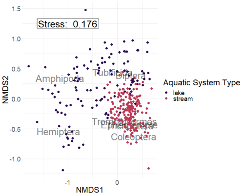
Looking at the NMDS we see the purple points (lakes) being more associated with Amphipods and Hemiptera. In contrast, pink points (streams) are more associated with Coleoptera, Ephemeroptera, Trombidiformes, and Trichoptera.
Tubificida and Diptera are located where purple (lakes) and pink (streams) points occur in the same space, implying that these orders are likely associated with both streams as well as lakes.
Additionally, glancing at the stress, we see that the stress is on the higher end (0.176). This is not super surprising because the high number of points (303) is likely to create issues fitting the points within a two-dimensional space.
Conclusions
For this tutorial, we talked about the theory and practice of creating an NMDS plot within R and using the vegan package.
NMDS can be a powerful tool for exploring multivariate relationships, especially when data do not conform to assumptions of multivariate normality.
Contact
If you have questions regarding this tutorial, please feel free to contact Michael Meyer at (michael DOT f DOT meyer AT wsu DOT edu).