ggplot2 tutorial
By Mikala Meize
Libraries used
1library(tidyverse)
2library(ggthemes)
The ggplot() function, which is used in this tutorial is housed within the tidyverse library. The ggthemes library is something we'll use later on in the tutorial.
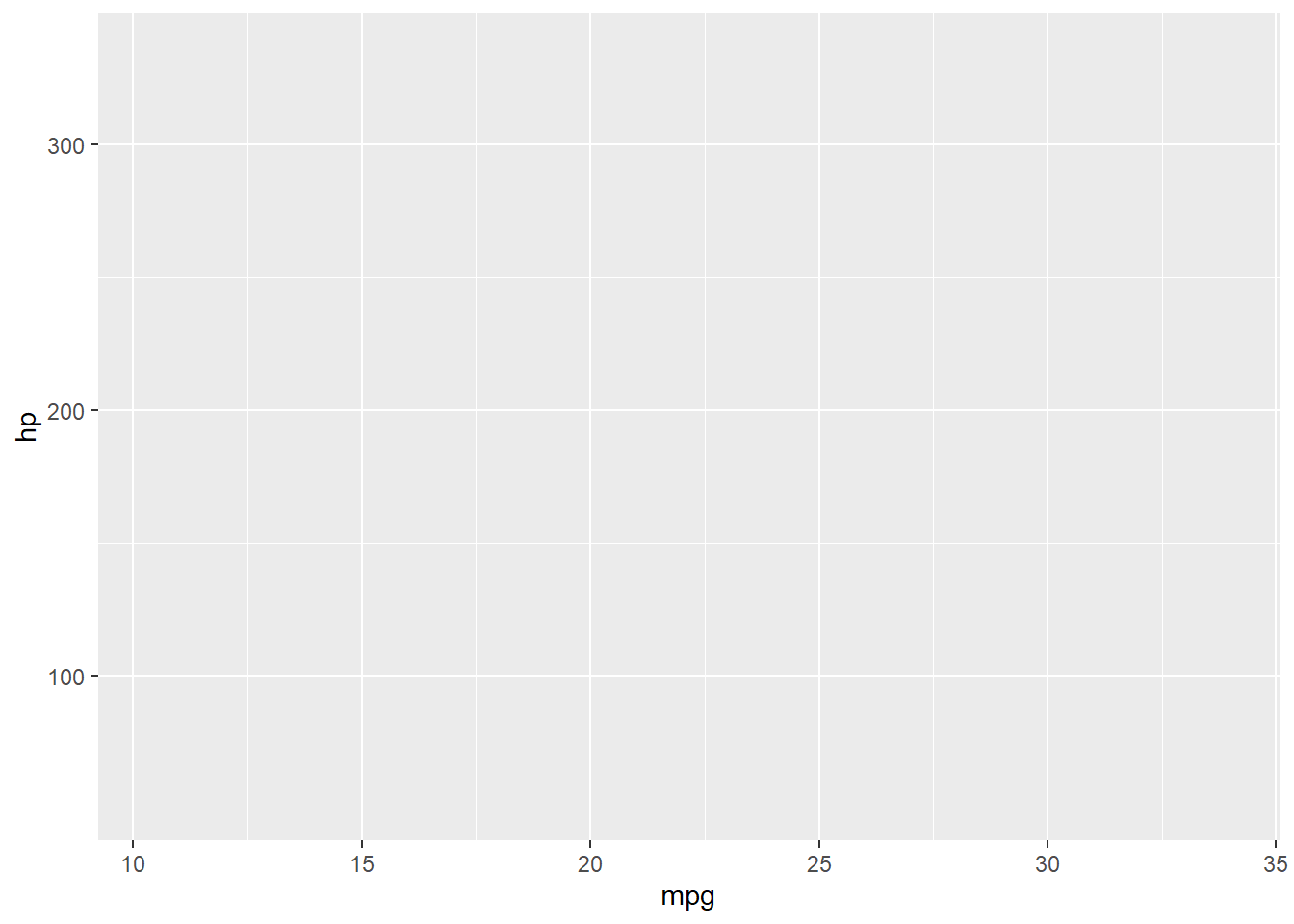
There are several ways to set up a plot using ggplot(). The first is to simply run:
1ggplot()

This tells R that you are prepping the plot space. You'll notice that the output is a blank space. This is because we have not specified an x or y axis, the variables we want to use, etc.
When building a plot with ggplot(), you add pieces of information in layers. These are separated by a plus sign (+). Whatever you include in the first layer, will be included in the following layers. For example, if we include a dataframe in the first layer:
1ggplot(data = mtcars)

Then each layer following will use that dataframe. Notice that even though we added a dataset, the output is still a blank space.
Something else to note about ggplot(), you can get the same plot using several different chunks of code. In the next example, I will plot the mpg variable from the mtcars dataset using two different sets of code. These both result in the same plot:
1ggplot(data = mtcars) +
2  geom_boxplot(aes(x = mpg)) #specified the data in the first layer and the x variable in the second

1ggplot(data = mtcars, aes(x = mpg)) +
2  geom_boxplot() #specified both data and x variable in the first layer and the type of plot alone in the second

These plots are the same, but using the aes() code, the x variable was specified in different layers. The 'aes' is short for aesthetic.
There are different reasons to include the data, the x, or the y variables in the first layer. If you want to layer data from different dataframes together in a plot, you'll likely start with ggplot() alone in the first layer. If you want to layer multiple x variables from the same dataset, then you might specify the data in the first layer: ggplot(data = df). Then, if you want to keep the same x or y variable as you add layers, you can specify that as well: ggplot(data = df, aes(x = variable, y = variable)).
Plotting variables together
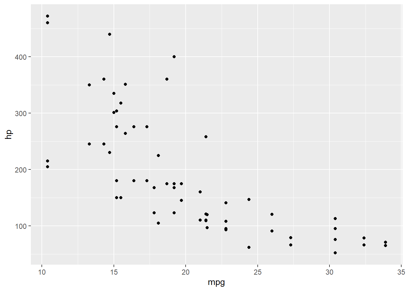
Using the dataset mtcars, mpg (miles per gallon) will be on the x axis and hp (horsepower) will be on the y axis.
1ggplot(data = mtcars, aes(x = mpg, y = hp))
I have not clarified how I want these variables plotted (lines, points, etc.) so the x and y axes are labeled, but there is no data in the plot space. In the next layer, I specify that I want the data plotted as points.
1ggplot(data = mtcars, aes(x = mpg, y = hp)) +
2  geom_point()

I am interested in the relationship between displacement and mpg too. By adding another layer, I can add a second y variable.
1ggplot(data = mtcars, aes(x = mpg)) +
2  geom_point(aes(y = hp)) +
3  geom_point(aes(y = disp))
Because I have two y variables, I removed the y specification from the first layer and added the separate y variables in their own layers. To differentiate one set of points from another, I can request different shapes for the data points based on variable.
1ggplot(data = mtcars, aes(x = mpg)) +
2  geom_point(aes(y = hp, shape = 'Horsepower')) +
3  geom_point(aes(y = disp, shape = 'Displacement'))
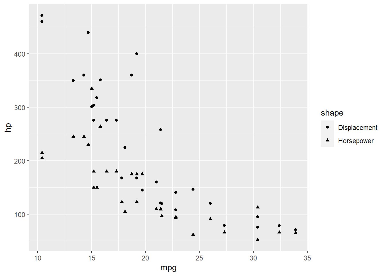
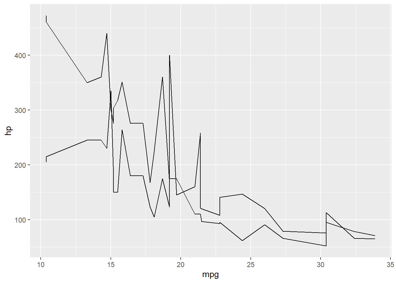
Now I can tell the difference between horsepower and displacement, and there is a legend off to the side explaining this. You can do the same thing with lines instead of points.
1ggplot(data = mtcars, aes(x = mpg)) +
2  geom_line(aes(y = hp)) +
3  geom_line(aes(y = disp))
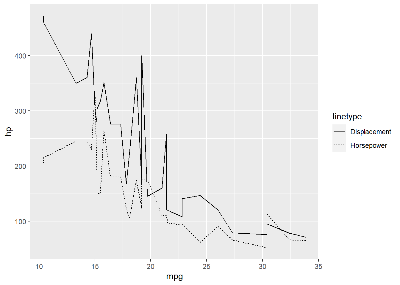
Instead of shape, use linetype to differentiate between variables.
1ggplot(data = mtcars, aes(x = mpg)) +
2  geom_line(aes(y = hp, linetype = 'Horsepower')) +
3  geom_line(aes(y = disp, linetype = 'Displacement'))
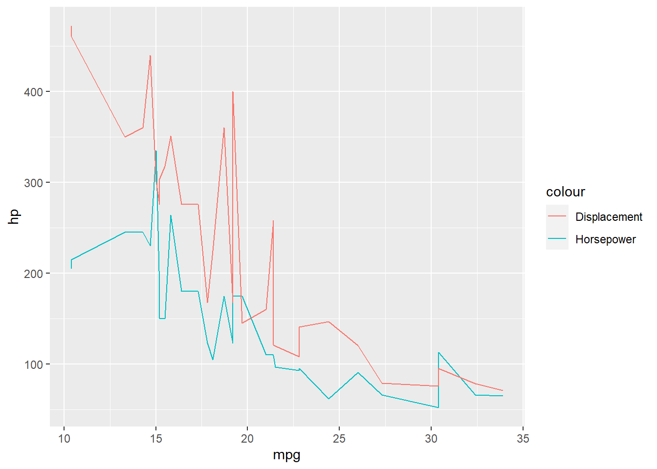
You can change the color of each plotted variable too. If you add the label inside aes(), then R picks the line color for you.
1ggplot(data = mtcars, aes(x = mpg)) +
2  geom_line(aes(y = hp, color = 'Horsepower')) +
3  geom_line(aes(y = disp, color = 'Displacement'))
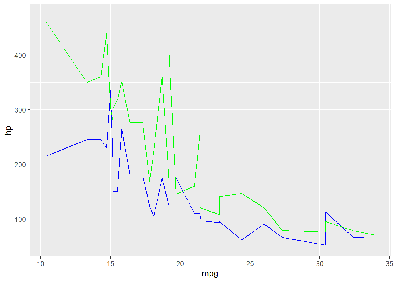
You can specify the color of each line by include the color code outside the aes().
1ggplot(data = mtcars, aes(x = mpg)) +
2  geom_line(aes(y = hp), color = 'blue') +
3  geom_line(aes(y = disp), color = 'green')
Publishable Plots
In the following example, I am using the economics dataset that comes loaded with R. I want to plot variables across time, so I'll use 'date' as the x axis.
1ggplot(data = economics, aes(x = date))
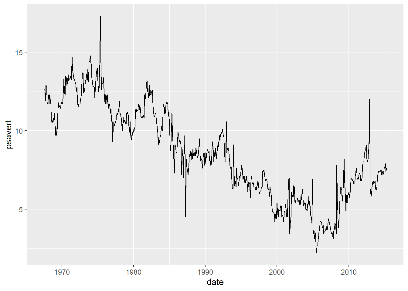
The first variable I'll plot is 'psavert' (Personal Savings Rate), and I'll plot it as a line.
1ggplot(data = economics, aes(x = date)) +
2  geom_line(aes(y = psavert))
The second variable I'll plot is 'uempmed' (Duration of Unemployment measured in weeks).
1ggplot(data = economics, aes(x = date)) +
2  geom_line(aes(y = psavert)) +
3  geom_line(aes(y = uempmed))
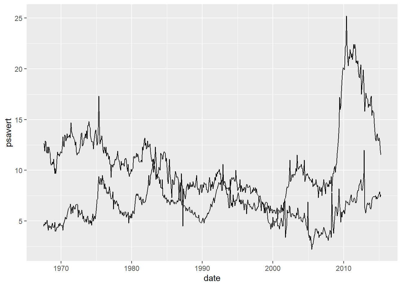
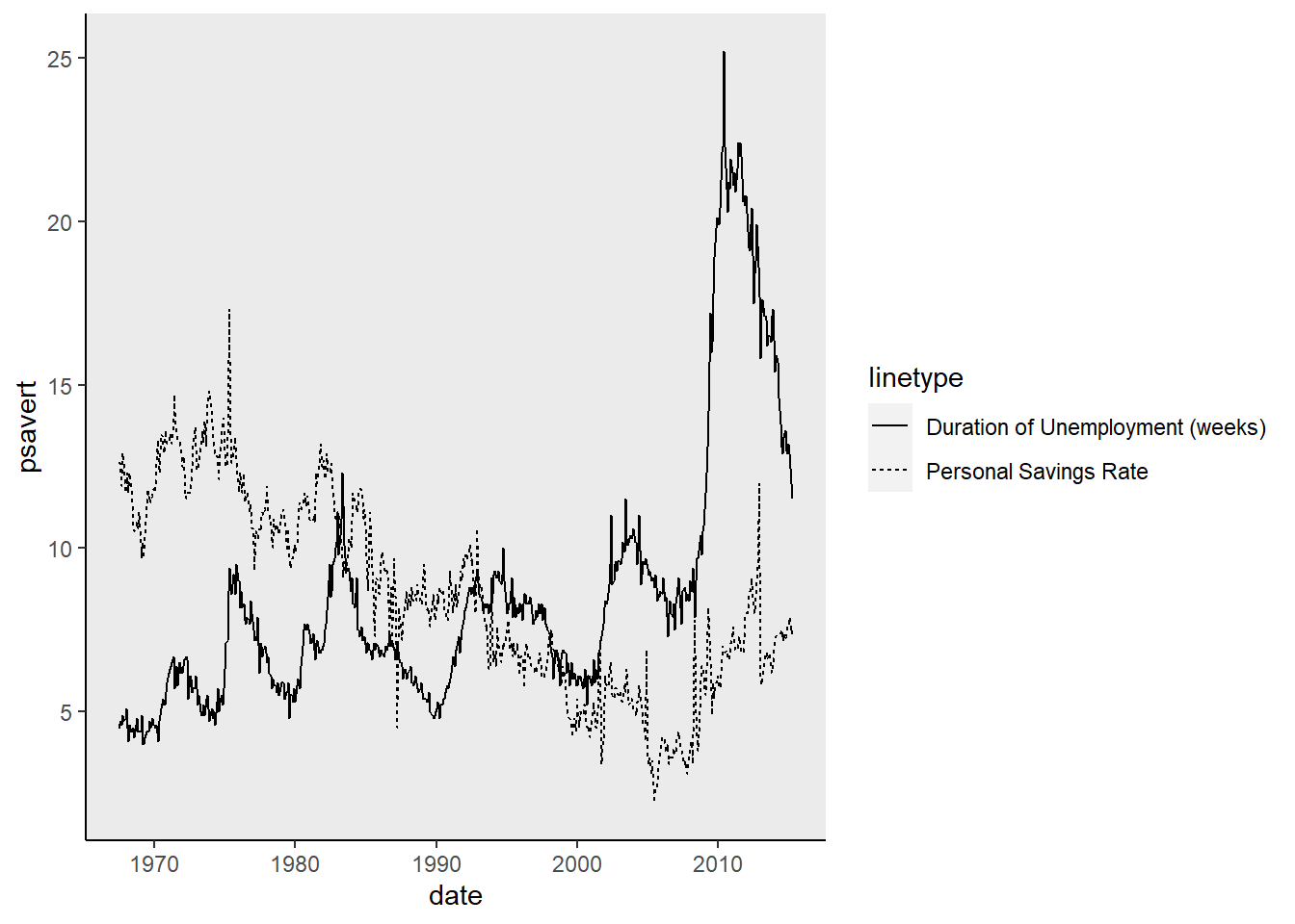
As before, the lines are indistinguishable. For this example, I want to make a black and white plot that I could publish with. So I'll let R choose the line type for these two variables.
1ggplot(data = economics, aes(x = date)) +
2  geom_line(aes(y = psavert, linetype = 'Personal Savings Rate')) +
3  geom_line(aes(y = uempmed, linetype = 'Duration of Unemployment (weeks)'))

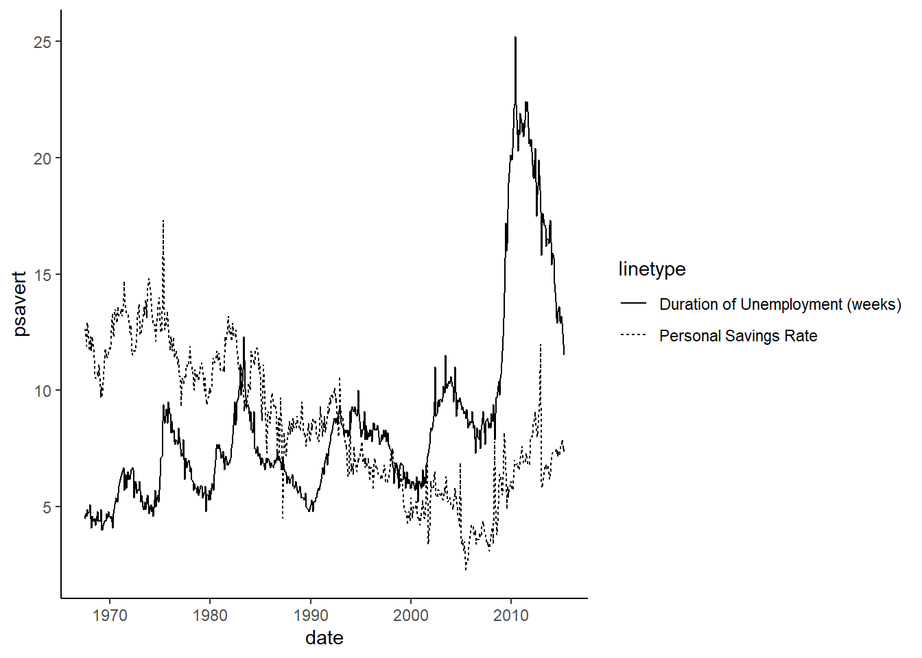
I have no need for the grid in the background so I can use the theme() layer to change this. You can remove some of the grid lines, or all of the grid lines.
1ggplot(data = economics, aes(x = date)) +
2  geom_line(aes(y = psavert, linetype = 'Personal Savings Rate')) +
3  geom_line(aes(y = uempmed, linetype = 'Duration of Unemployment (weeks)')) +
4  theme(panel.grid.major = element_blank())

1ggplot(data = economics, aes(x = date)) +
2  geom_line(aes(y = psavert, linetype = 'Personal Savings Rate')) +
3  geom_line(aes(y = uempmed, linetype = 'Duration of Unemployment (weeks)')) +
4  theme(panel.grid.major = element_blank(),
5        panel.grid.minor = element_blank())

If you want zero grid lines, you can skip a step and do this:
1ggplot(data = economics, aes(x = date)) +
2  geom_line(aes(y = psavert, linetype = 'Personal Savings Rate')) +
3  geom_line(aes(y = uempmed, linetype = 'Duration of Unemployment (weeks)')) +
4  theme(panel.grid = element_blank())

I want to add axis lines for both x and y, and I want them to be black.
1ggplot(data = economics, aes(x = date)) +
2  geom_line(aes(y = psavert, linetype = 'Personal Savings Rate')) +
3  geom_line(aes(y = uempmed, linetype = 'Duration of Unemployment (weeks)')) +
4  theme(panel.grid = element_blank(),
5        axis.line = element_line(color = 'black'))
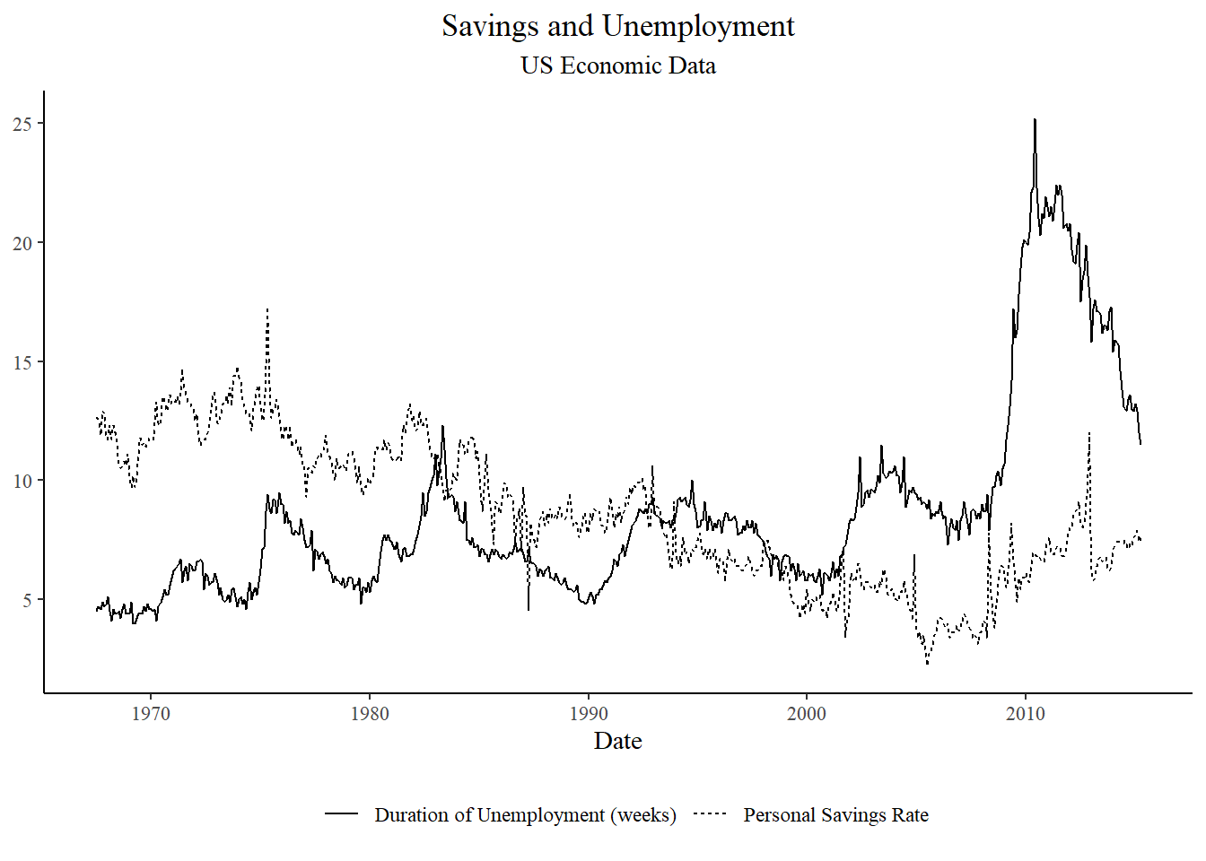
We can also use preset themes. Most of these themes are in the tidyverse library, but some of the more unique themes are part of the ggthemes library. I tend to use the theme_bw() or the theme_classic() when building my publishable plots.
Note: the premade/preset theme must go before the theme() specifications you make.
1ggplot(data = economics, aes(x = date)) +
2  geom_line(aes(y = psavert, linetype = 'Personal Savings Rate')) +
3  geom_line(aes(y = uempmed, linetype = 'Duration of Unemployment (weeks)')) +
4  theme_bw() +                                                                    #this theme adds a border around the plot
5  theme(panel.grid = element_blank(),
6        panel.border = element_blank(),                                           #this code removes the border
7        axis.line = element_line(color = 'black'))
1ggplot(data = economics, aes(x = date)) +
2  geom_line(aes(y = psavert, linetype = 'Personal Savings Rate')) +
3  geom_line(aes(y = uempmed, linetype = 'Duration of Unemployment (weeks)')) +
4  theme_classic()

1#theme_classic() does all of the things I did manually above, but in one line of code instead of several.
Currently the plot is very wide with the legend on the right, so I am going to move it to the bottom of the plot using the theme() options.
1ggplot(data = economics, aes(x = date)) +
2  geom_line(aes(y = psavert, linetype = 'Personal Savings Rate')) +
3  geom_line(aes(y = uempmed, linetype = 'Duration of Unemployment (weeks)')) +
4  theme_classic() +
5  theme(legend.position = 'bottom')

This looks much better, but the axis titles and the legend title are still not publishable quality. I can fix the axis and plot titles using the labs() layer.
1ggplot(data = economics, aes(x = date)) +
2  geom_line(aes(y = psavert, linetype = 'Personal Savings Rate')) +
3  geom_line(aes(y = uempmed, linetype = 'Duration of Unemployment (weeks)')) +
4  theme_classic() +
5  theme(legend.position = 'bottom') +
6  labs(x = 'Date',
7       y = NULL,
8       title = 'Savings and Unemployment',
9       subtitle = 'US Economic Data')
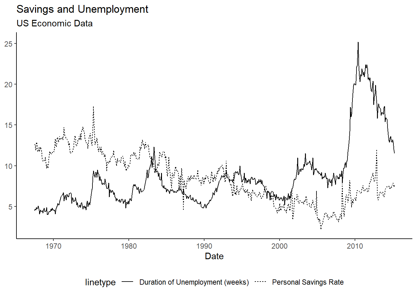
My plot now has no Y axis title, a grammatically correct x axis title, a plot title, and a subtitle. In this next step, I'll go back to the theme() options and center the plot title and get rid of the legend title.
 1ggplot(data = economics, aes(x = date)) +
 2  geom_line(aes(y = psavert, linetype = 'Personal Savings Rate')) +
 3  geom_line(aes(y = uempmed, linetype = 'Duration of Unemployment (weeks)')) +
 4  theme_classic() +
 5  theme(legend.position = 'bottom',
 6        plot.title = element_text(hjust = 0.5),        #Center the title
 7        plot.subtitle = element_text(hjust = 0.5),     #Center the subtitle
 8        legend.title = element_blank()) +              #Remove the legend title
 9  labs(x = 'Date',
10       y = NULL,
11       title = 'Savings and Unemployment',
12       subtitle = 'US Economic Data')
Now I have a beautiful black and white plot, with no odd coding language. This can be exported from R as an image or as a PDF.
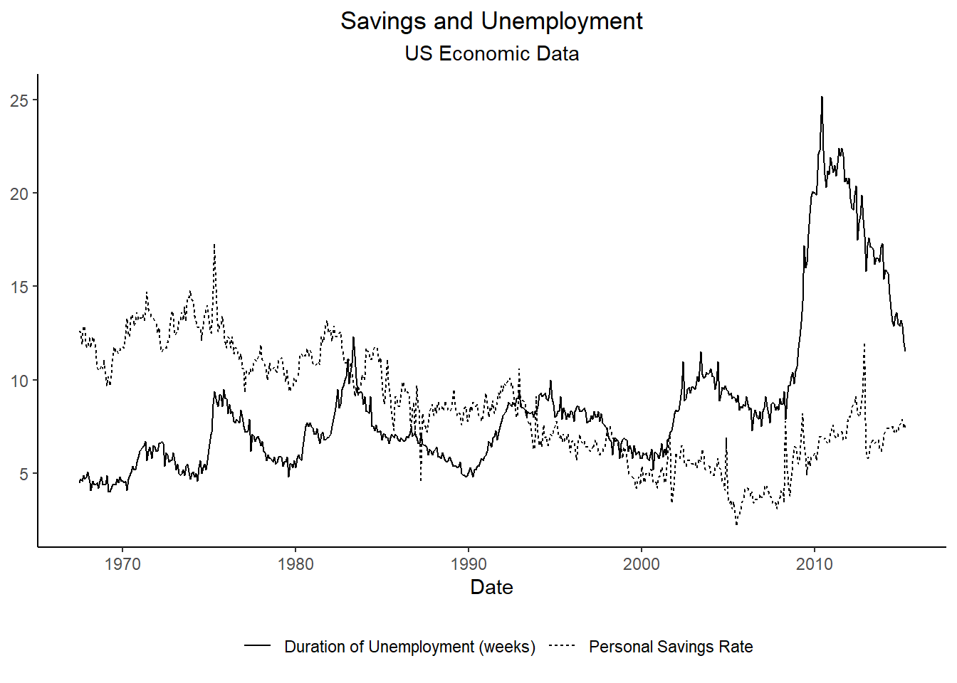
Sometimes a journal will want you to match the font of your plots to the font of your text. I've found a nice theme (from ggthemes library) I like to use for this.
 1ggplot(data = economics, aes(x = date)) +
 2  geom_line(aes(y = psavert, linetype = 'Personal Savings Rate')) +
 3  geom_line(aes(y = uempmed, linetype = 'Duration of Unemployment (weeks)')) +
 4  theme_tufte() +
 5  theme(legend.position = 'bottom',
 6        plot.title = element_text(hjust = 0.5),
 7        plot.subtitle = element_text(hjust = 0.5),
 8        legend.title = element_blank(),
 9        axis.line = element_line(color = 'black')) +    #This theme removes all axis lines, I've added them back here.
10  labs(x = 'Date',
11       y = NULL,
12       title = 'Savings and Unemployment',
13       subtitle = 'US Economic Data')
There are so many more things you can do with ggplot, this is only a start to the possibilities. I highly recommend browing the ggplot website and their posted cheat sheets to learn more: https://ggplot2.tidyverse.org/